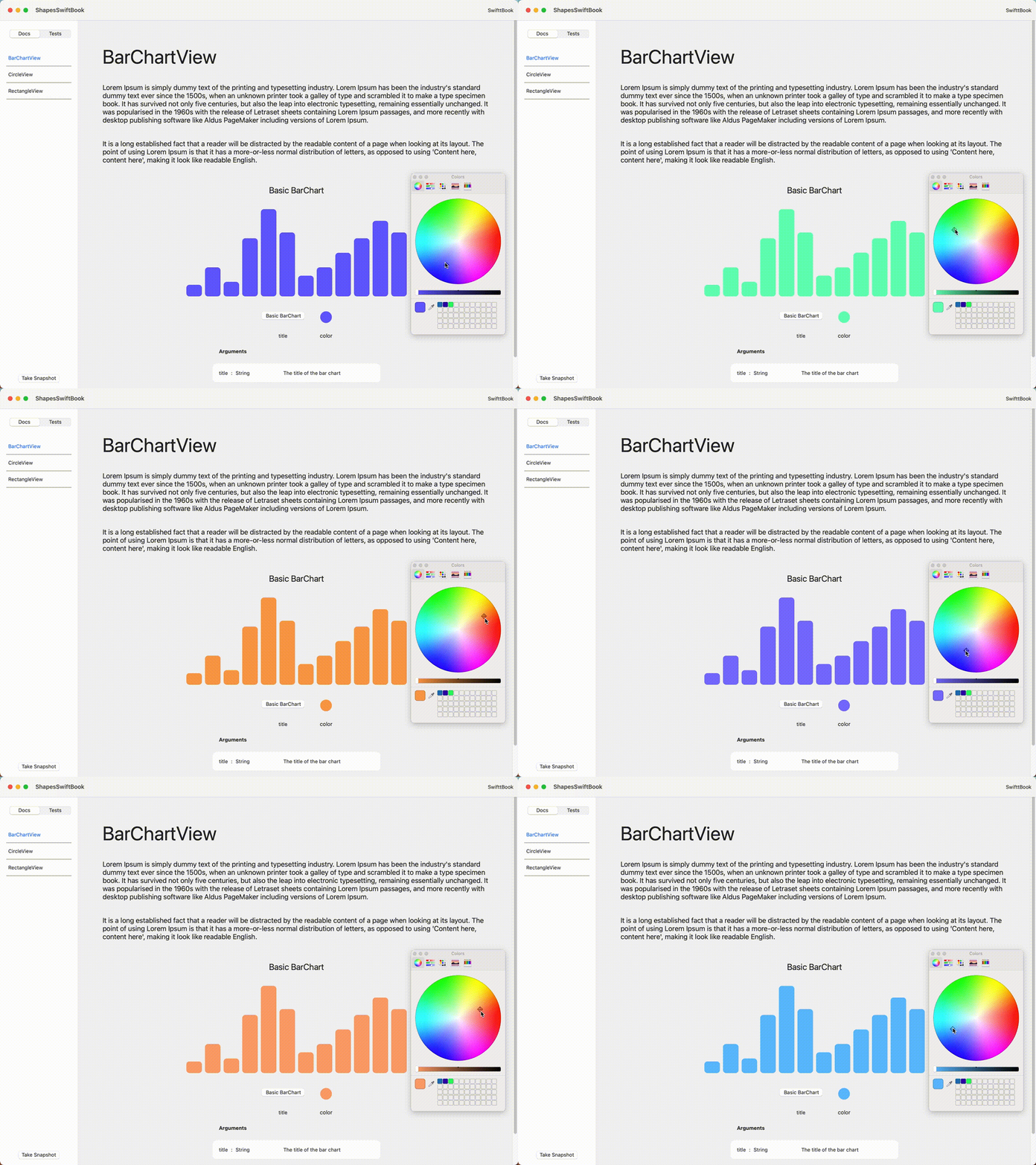
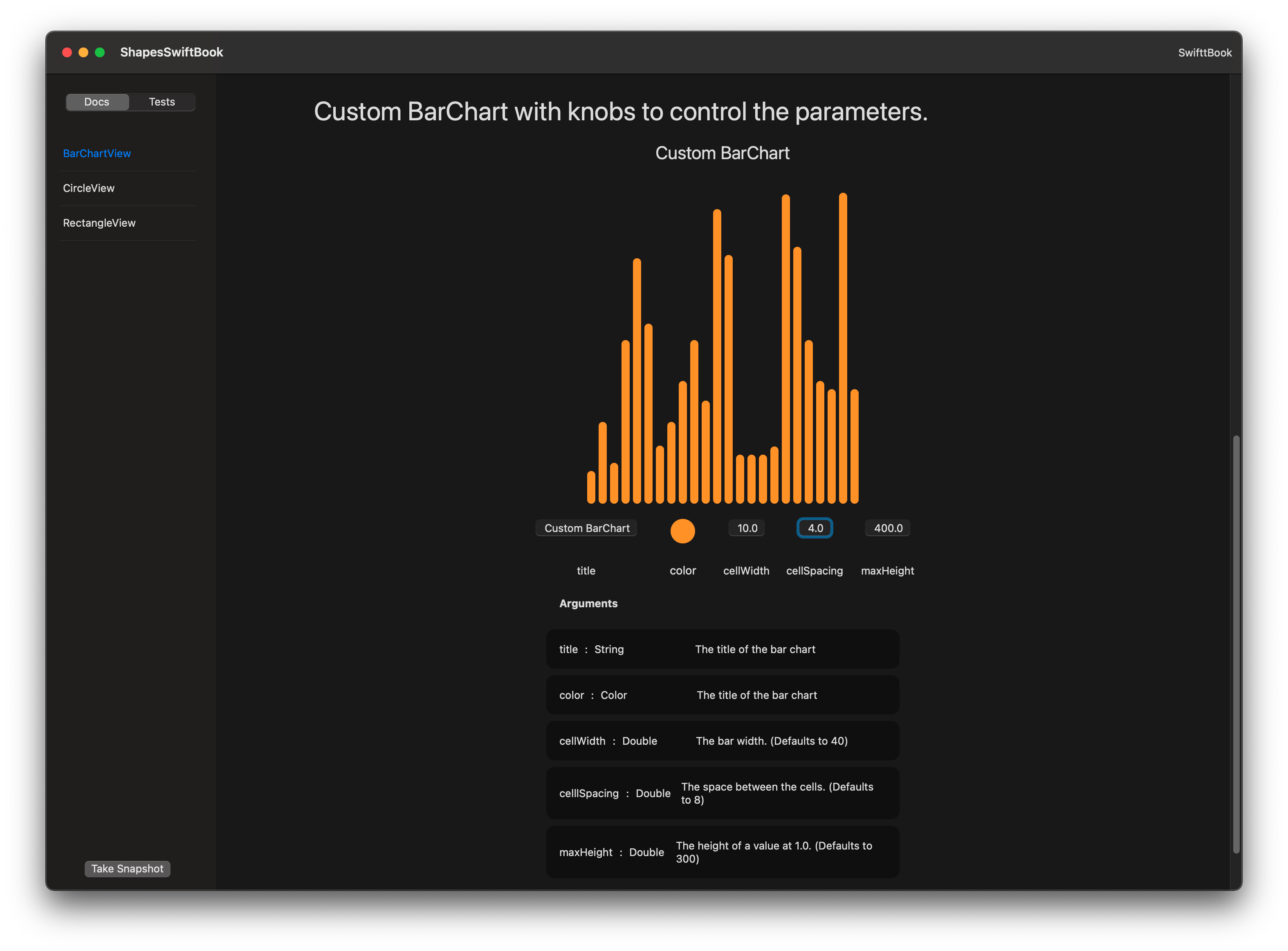
A Swift library for documenting, isolating, and testing SwiftUI, UIKit & AppKit components.
Full example app at https://github.com/hpennington/shapes.git
An example demonstrated with the Slider ui element.
// Create a "doc" that conforms to View.
struct SliderDoc: View {
    @State private var value: Double = 0.0

    // Use the markup components provided with SwiftBook to
    // describe your components.
    //
    // Wrap your component in `SwiftBookComponent` to get the snapshot
    // testing and more.
    var body: some View {
        H1("Slider")
        P("A Slider element provided by Apple for SwiftUI.")
        Component {
            Slider(value: $value)
        }

    }
}

// Add your "doc" to the SwiftBook documents table.
@main
struct SwiftBookApp: App {
    var body: some Scene {
        SwiftBookWindowGroup {
            SwiftBook([
                ("Slider", AnyView(SliderDoc())),
            ])
        }
    }
}// Create a "doc" that conforms to View.
struct SliderDoc: View {
@State private var value: Double = 0.0
var body: some View {
Bookable(title: "Slider", detail: "A slider element provded by Apple for SwiftUI.") {
Slider(value: $value)
}
}
}struct CircleView: View {
let color: Color
let label: String
let labelColor: Color
var body: some View {
ZStack {
Circle()
.frame(width: 300, height: 300, alignment: .center)
.foregroundColor(color)
Text(label)
.foregroundColor(labelColor)
.font(.headline)
}
}
}
struct CircleDoc: View {
@State private var color: Color = .red
@State private var label: String = "Red Circle"
@State private var labelColor: Color = .primary
var body: some View {
H2("A red circle")
H3("This is a description of a red circle.")
Component {
CircleView(color: color, label: label, labelColor: labelColor)
}
ControlsTable {
ControlColor(color: $color, title: "color")
ControlColor(color: $labelColor, title: "labelColor")
ControlText(text: $label, label: "label")
}
}
}


