| title | tags | layout | mathjax | display_image | ipynb | |||||
|---|---|---|---|---|---|---|---|---|---|---|
Experiment in dataviz: faces in a crowd |
|
post |
true |
2020-01-06-ex.png |
A few months ago I trained models that could map a vector into a drawing of a face to create an esoteric data visualization called Chernoff faces.
Recently I packaged up some of the learned functions into my first every pypi package: vec2face. Now you too can draw vectors as faces vec2face using pip install vec2face.
To demonstrate the new package, I tried a new data visualization: faces in a crowd.
I like how weird-but-maybe-useful Chernoff faces are, so tried to make it even more weird-but-maybe-useful by mapping out faces for a dataset. This creates a crowd of faces where one can pick out clusters and outliers.
To demo, I used the vector-representations of library catalog subjects from a previous post.
The vectors have sixteen values per library catalog subject. To choose the location of the face, I use UMAP to reduce the dataset to 2 dimensions. For the visualization, I create a grid and choose one data point to illustrate for each region. Then I used the vec2face class to illustrate these vectors.
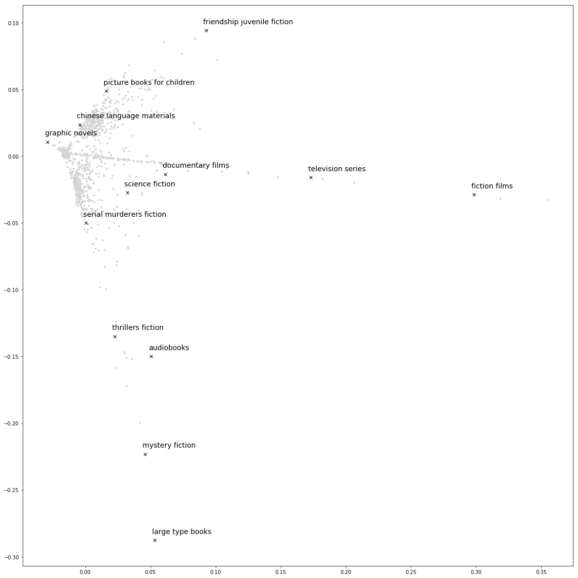
I see this as an alternative visualization to the one I had in the original embeddings. The original visualization used PCA instead of UMAP, shows all data points, and labels a few points.
When mapping the 16-dimensional data to two dimensions, some structure is lost. The faces are a way to represent the full 16-dimensional vector. For example, while data points might be neighbors in UMAP, they might have different enough vectors to make very different faces. Other times, the vectors might be different but it's harder to notice the difference between the faces.


