This library was generated with Angular CLI version 12.2.0.
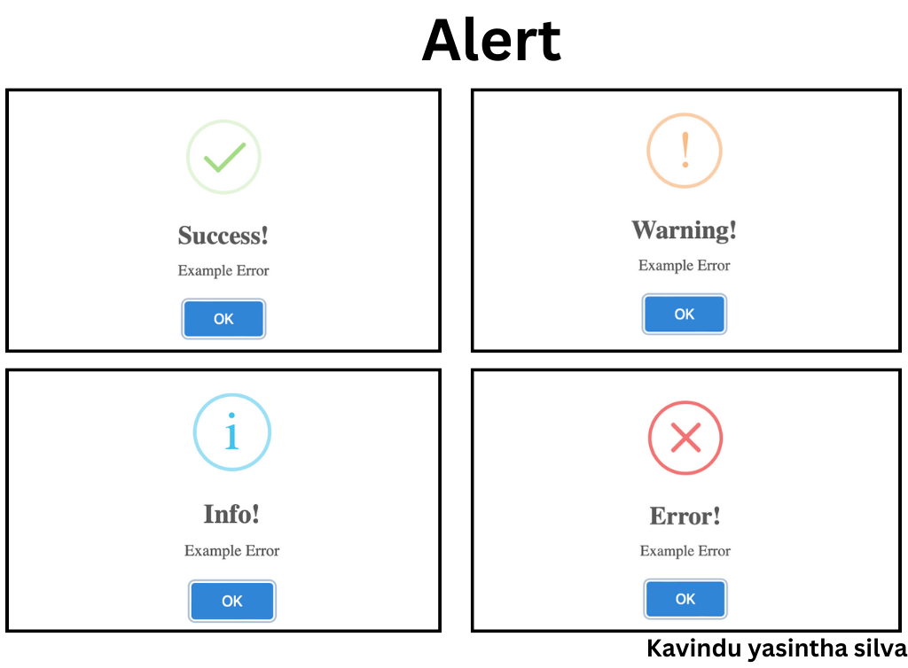
ng-alert-box-popup is an Angular library that provides a customizable alert box component with support for different types of alerts using SweetAlert2.
To use ng-alert-box-popup in your Angular project, follow these steps:
-
Install the library using npm:
npm install ng-alert-box-popup
npm i sweetalert2@7.33.1
2.Import the NgAlertBoxModule into your application's Components:
import {NgAlertBoxComponent} from "ng-alert-box-popup";Once you've imported the NgAlertBoxModule into your application, you can use the NgAlertBoxComponent to display different types of alerts:
Import the NgAlertBoxService in your component:
import { Component } from '@angular/core';
import { NgAlertBoxService } from 'ng-alert-box-popup';

@Component({
selector: 'app-root',
template: `
  <button (click)="showSuccessAlert()">Show Success Alert</button>
  <button (click)="showErrorAlert()">Show Error Alert</button>
`
})
export class AppComponent {

constructor(private alerts: NgAlertBoxService) {}

showSuccessAlert() {
   this.alerts.dialog('I','Example Error');
}

showErrorAlert() {
   this.alerts.dialog('I','Example Error');
}
} this.alerts.dialog('I','Example Error');This library is released under the MIT License. See LICENSE for details.
We welcome contributions from the community. Please read our Contribution Guidelines for more information.
If you encounter any issues or have questions, please feel free to open an issue in our GitHub repository.
Happy coding!
https://github.com/kavindyasinthasilva/ng-alert-box