-
Notifications
You must be signed in to change notification settings - Fork 0
Backgrounds
Background properties specify the drawing of the background of a field.
Backgrounds are drawn behind the content of a field (e.g. its text) inside the content and padding areas in the CSS box model.
| Value | 1 Color |
| Initial | transparent |
| Applies To | all fields and managers |
| Percentages | N/A |
Sets the background color of a field.
style {
    background-color: green; /* the background color is set to green */
}
| Value | 1 URL |
| Initial | none |
| Applies To | all fields and managers |
| Percentages | N/A |
Sets the background image of a field.
style {
    background-image: url(image.png); /* the background image is set to image.png */
}
| Value | repeat repeat-x repeat-y no-repeat |
| Initial | no-repeat |
| Applies To | all fields and managers |
| Percentages | N/A |
If a background image is specified, this property specifies whether the image is repeated (tiled), and how.
All tiling covers the content and padding area of a field in the CSS box mode.
repeat
The image is repeated both horizontally and vertically.
repeat-x
The image is repeated horizontally only.
repeat-y
The image is repeated vertically only.
no-repeat
The image is not repeated: only one copy of the image is drawn.
style {
    background-image: url(image.png); 	/* the background image is set to image.png */
    background-repeat: repeat-x; 	/* the background image is repeated horizontally */
}
| Value | 1 or 2 Dimensions top right bottom left center |
| Initial | center center |
| Applies To | all fields and managers |
| Percentages | N/A |
If a background image has been specified, this property specifies its initial position.
One or two values may be specified.
If the first value is a Dimension it describes the horizontal offset from the left edge of the background area, if its a relative value (left, right, center) the horizontal offset respective to the value is calculated.
If the second value is a Dimension it describes the vertical offset from the top edge of the background area, if its a relative value (top, bottom, center) the vertical offset respective to the value is calculated.
If only one value is specified, the second value is assumed to be ‘center’.
top
The image is positioned to the top.
right
The image is positioned to the right.
bottom
The image is positioned to the bottom.
left
The image is positioned to the left.
center
If this value is given as the first of two values, the image is centered horizontally. Otherwise,
the image is centered vertically.
style {
	background-image: url(image.png); 	/* the background image is set to image.png */
	background-position: top left; 		/* the background image is positioned to the top/left */
}
Besides the basic properties above backgrounds can be declared in a “backgrounds” block in a stylesheet.
These backgrounds are declared with an id to reuse them in multiple styles and with a property “type” to create advanced backgrounds.
A background in the “backgrounds” block is declared with an id, a type and properties associated with the type:
backgrounds {
	myBg {
		type: gradient;
		colors: red blue;
	}
}
A background with the id “myBg” of the type “gradient” is created which will draw a gradient from red to blue
To use a background declared in the “backgrounds” section a style references the background by using the property “background” and the id of the background:
style {
    background: myBg;
}
The above style declaration creates a style which uses the previously declared background “myBg”
Alternatively, backgrounds can be directly declared inside a style:
style {
	background {
		type: gradient;
		colors: red blue;
	}
}
A style is created which declares and uses an anonymous background that draws a gradient from red to blue
Backgrounds declared in the “backgrounds” section can also extend other backgrounds. All properties from the background to extend are inherited and properties in the extending background are added or overwrite properties from the background to extend:
backgrounds {
	myBg {
		type: image;
		image: url(image.png);
		position: top center;
	}

	myExtendedBg extends myBg {
		position: top left;
		repeat: repeat;
	}
}
The background “myExtendedBg” extends the background “myBG” thus inheriting all properties of “myBG”, overwriting the “position” property and adding its own “repeat” property

Creates a solid background that draws a single color in the background area of a field.
mySolidBackground {
	type: solid; 	/* the background type is solid */
	color: red; 	/* the color is red */
}
| Value | 1 Color |
| Initial | transparent |
| Applies To | solid backgrounds |
| Percentages | N/A |
Sets the color of the solid background.
mySolidBackground {
	type: solid;
	color: red; /* the color of the solid background is red */
	margin: 5%;
}
| Value | 1,2,3 or 4 Dimensions |
| Initial | 0 |
| Applies To | all backgrounds |
| Percentages | refer to the display width |
Sets the margin of the background and is specified the same way as the margin property.
mySolidBackground {
	type: solid;
	color: red;
	margin: 5%; 	/* the margin is 5% */
}

Creates an image background that draws an image at a given position and a given repeat / tiling.
myImageBackground {
	type: image;		/* the background type is image */
	image: url(image.png);	/* the image of the background is image.png */
}
| Value | 1 URL |
| Initial | none |
| Applies To | image backgrounds |
| Percentages | N/A |
Sets the background image.
myImageBackground {
	type: image;
	image: url(image.png); 	/* the image of the background is image.png */
	repeat: repeat-x;
	position: center;
	margin: 5%;
}
| Value | repeat repeat-x repeat-y no-repeat |
| Initial | no-repeat |
| Applies To | all fields and managers |
| Percentages | N/A |
If a background image is specified, this property specifies whether the image is repeated (tiled), and how.
All tiling covers the content, padding and border areas of a field in the CSS box mode.
repeat
The image is repeated both horizontally and vertically.
repeat-x
The image is repeated horizontally only.
repeat-y
The image is repeated vertically only.
no-repeat
The image is not repeated: only one copy of the image is drawn.
myImageBackground {
	type: image;
	image: url(image.png);
	repeat: repeat-x; 		/* the image is repeated on the horizontal axis*/
	position: center;
	margin: 5%;
}
| Value | 1 or 2 Dimensions top left right bottom center |
| Initial | center center |
| Applies To | all fields and managers |
| Percentages | N/A |
If a background image has been specified, this property specifies its initial position.
One or two values may be specified.
If the first value is a Dimension it describes the horizontal offset from the left edge of the background area, if its a relative value (left, right, center) the horizontal offset respective to the value is calculated.
If the second value is a Dimension it describes the vertical offset from the top edge of the background area, if its a relative value (top, bottom, center) the vertical offset respective to the value is calculated.
If only one value is specified, the second value is assumed to be ‘center’.
top
The image is positioned to the top.
right
The image is positioned to the right.
bottom
The image is positioned to the bottom.
left
The image is positioned to the left.
center
If this value is given as the first of two values, the image is centered horizontally. Otherwise,
the image is centered vertically.
myImageBackground {
	type: image;
	image: url(image.png);
	repeat: repeat-x;
	position: center; 		/* the position of the image is centered */
	margin: 5%;
}
| Value | 1,2,3 or 4 Dimensions |
| Initial | 0 |
| Applies To | all backgrounds |
| Percentages | refer to the display width |
Sets the margin of the background and is specified the same way as the margin property.
myImageBackground {
	type: image;
	image: url(image.png);
	repeat: repeat-x;
	position: center;
	margin: 5%; 			/* the margin is 5% */
}

Creates a solid background with rounded edges.
myRoundedBackground {
	type: rounded; 		/* the background type is rounded */
	color: orange; 		/* the color is orange */
	width: 3%; 		/* the width and height of the rounded edges is 3% */
}
| Value | 1 Color |
| Initial | transparent |
| Applies To | rounded backgrounds |
| Percentages | N/A |
Sets the color of the rounded background.
myRoundedBackground {
	type: rounded;
	color: blue; 	/* the color is blue */
	width: 3%;
	margin: 5%;
}
| Value | 1 or 4 Dimensions |
| Initial | none |
| Applies To | rounded backgrounds |
| Percentages | refer to the display width |
Specifies the width and height of the rounded edges.
If there is only one component value, it specifies the width and height of each rounded edge.
myRoundedBackground {
	type: rounded;
	color: blue;
	width: 3%; 	/* the width and height of the rounded edges is 3% */
	margin: 5%;
}
If there are four values,
- the first value specifies the height of the top left and top right edge,
- the second value specifies the width of the top right and bottom right edge,
- the third value specifies the height of the bottom left and bottom right edge
- the fourth value specifies the width of the top left and bottom left edge
myRoundedBackground {
	type: rounded;
	color: blue;
	width: 10px 15px 10px 15px; 	/* the heights of the top and bottom edges are 10px, the width of the left and right edges are 15px */
	margin: 5%;
}
| Value | 1,2,3 or 4 Dimensions |
| Initial | 0 |
| Applies To | all backgrounds |
| Percentages | refer to the display width |
Sets the margin of the background and is specified the same way as the margin property.
myRoundedBackground {
	type: rounded;
	color: blue;
	width: 3%;
	margin: 5%; 		/* the margin is 5% */
}

Creates a vertical or horizontal gradient background that draws a gradient using two specified colors and offets.
myGradientBackground {
	type: gradient; 		/* the background type is gradient */
	orientation: horizontal; 	/* the gradient orientation is horizontal */
	colors: green yellow; 		/* the start color is green, the end color is yellow */
	offsets: 25% 75%; 		/* the gradient should start at 25% of the background area and end at 75% of the background area */
	margin: 5%; 			/* the margin is 5% */
}
| Value | horizontal vertical |
| Initial | vertical |
| Applies To | gradient backgrounds |
| Percentages | N/A |
Sets the orientation of the gradient.
myGradientBackground {
	type: gradient;
	orientation: horizontal; 	/* the gradient orientation is horizontal */
	colors: green yellow;
	offsets: 25% 75%;
	margin: 5%;
}
| Value | 2 Colors |
| Initial | none |
| Applies To | gradient backgrounds |
| Percentages | N/A |
Sets the start and end color with the first being the start color and the second being the end color.
myGradientBackground {
	type: gradient;
	orientation: horizontal;
	colors: green yellow; 		/* the start color is green, the end color is yellow */
	offsets: 25% 75%;
	margin: 5%;
}
| Value | 2 Dimensions |
| Initial | none |
| Applies To | gradient backgrounds |
| Percentages | refer to the available background width |
Sets the start and end offsets with the first value being the start offset and the second value being the end offset.
The area before a specified start offset is filled with the start color, the area after the specified end
offset is filled with the end color.
myGradientBackground {
	type: gradient;
	orientation: horizontal;
	colors: green yellow;
	offsets: 25% 75%; 			/* the gradient should start at 25% of the background area and end at 75% of the background area */
	margin: 5%;
}
| Value | 1,2,3 or 4 Dimensions |
| Initial | 0 |
| Applies To | all backgrounds |
| Percentages | refer to the display width |
Sets the margin of the background and is specified the same way as the margin property.
myGradientBackground {
	type: gradient;
	orientation: horizontal;
	colors: green yellow;
	offsets: 25% 75%;
	margin: 5%; 			/* the margin is 5% */
}

Creates a background drawing a scalable vector graphic (SVG) file. The SVG file is always rendered to fit the available background area.
BlackBerry uses the SVG Tiny 1.1 and subsets of SVG Tiny 1.2 to render SVG files. For details read the
documentation.
The SVG data is rendered to a bitmap which has the dimension of the background area and
might (depending on the extent of the area) consume a lot of memory.
mySvgBackground {
	type: svg; 		/* the background type is svg*/
	file: url(file.png);	/* the SVG file is file.svg */
	margin: 5%; 		/* the margin is 5% */
}
| Value | 1 URL |
| Initial | none |
| Applies To | svg backgrounds |
| Percentages | N/A |
Specifies the SVG file to use.
mySvgBackground {
	type: svg;
	file: url(file.png);		/* the SVG file is file.svg */
	margin: 5%;
}
| Value | 1,2,3 or 4 Dimensions |
| Initial | 0 |
| Applies To | all backgrounds |
| Percentages | refer to the display width |
Sets the margin of the background and is specified the same way as the margin property.
mySvgBackground {
	type: svg;
	file: url(file.png);
	margin: 5%;		/* the margin is 5% */
}

Creates a tiled/bitmap background.
myTiledBackground {
	type: tiled; 		/* the background type is tiled*/
	image: url(tiled.png);	/* the image is tiled.png */
	width: 10px; 		/* the width and height of the edges is 10 pixels */
	margin: 5%; 		/* the margin is 5% */
}
A tiled background is declared with the widths and heights of the corners of the specified image. The horizontal, vertical and center parts of the image between the declared corners are then repeated/tiled to fill the background area.
For example, this is the image with the width and height of 40 pixels is used in a tiled background:

The edges are specified with 10 pixels:
myTiledBackground {
	type: tiled;
	image: url(tiled.png);
	width: 10px;
}
The resulting background for an area of 200 × 100 pixels will look like this:

| Value | 1 URL |
| Initial | none |
| Applies To | tiled backgrounds |
| Percentages | N/A |
Specifies the image to use.
myTiledBackground {
	type: tiled;
	image: url(tiled.png);	/* the image is tiled.png */
	width: 10px;
	margin: 5%;
}
| Value | 1 or 4 Dimensions |
| Initial | none |
| Applies To | tiled backgrounds |
| Percentages | refer to the display width |
Specifies the width and height of the edges.
If there is only one component value, it specifies the width and height of each rounded edge.
myTiledBackground {
	type: tiled;
	image: url(tiled.png);
	width: 3%; 		/* the width and height of the edges is 3% */
	margin: 5%;
}
If there are four values:
- the first value specifies the height of the top left and top right edge
- the second value specifies the width of the top right and bottom right edge
- the third value specifies the height of the bottom left and bottom right edge
- the fourth value specifies the width of the top left and bottom left edge
myTiledBackground {
	type: tiled;
	image: url(tiled.png);
	width: 10px 15px 10px 15px;
	/* the heights of the top and bottom edges are 10px, the width of the left and right edges are 15px */
	margin: 5%;
}
| Value | 1,2,3 or 4 Dimensions |
| Initial | 0 |
| Applies To | all backgrounds |
| Percentages | refer to the display width |
Sets the margin of the background and is specified the same way as the margin property.
myTiledBackground {
	type: tiled;
	image: url(tiled.png);
	width: 3%;
	margin: 5%;		/* the margin is 5% */
}

Creates a masked background. The alpha/transparency values of the given mask background are applied
to a given background and the result is drawn.
The blending of the two backgrounds creates a bitmap which has the dimension of the background area and
might (depending on the extent of the area) consume a lot of memory.
myMaskBackground {
	type: mask; 			/* the background type is mask */
	mask: myMask; 			/* the mask is a background with the id "myMask" */
	background: myBackground; 	/* the background to mask is a background with the id "myBackground" */
	margin: 5%;	 		/* the margin is 5% */
}
For example, the mask is this rounded background:

The background to apply the mask is this gradient background:

Then the resulting background will look like this:

| Value | 1 background id |
| Initial | none |
| Applies To | mask backgrounds |
| Percentages | N/A |
Specifies the background to be used as the mask.
myMaskBackground {
	type: mask;
	mask: myMask; 				/* the mask is a background with the id "myMask" */
	background: myBackground;
	margin: 5%;
}
| Value | 1 background id |
| Initial | none |
| Applies To | mask backgrounds |
| Percentages | N/A |
Specifies the background to apply the specified mask to.
myMaskBackground {
	type: mask;
	mask: myMask;
	background: myBackground;
	/* the background to mask is a background with the id "myBackground" */
	margin: 5%;
}
| Value | 1,2,3 or 4 Dimensions |
| Initial | 0 |
| Applies To | all backgrounds |
| Percentages | refer to the display width |
Sets the margin of the background and is specified the same way as the margin property.
myMaskBackground {
	type: mask;
	mask: myMask;
	background: myBackground;
	margin: 5%;		/* the margin is 5% */
}
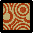
Creates a background that draws multiple backgrounds on top of each other.
myLayerBackground {
	type: layer; 				/* the background type is layer */
	backgrounds: myBottomLayer myTopLayer; 	/* the ids of the backgrounds to draw */
	margin: 5%; 				/* the margin is 5% */
}
For example, if the first of two backgrounds in the ‘backgrounds’ property is the id of this rounded background:

and the second is the id of this image background:

The resulting background will look like this:

| Value | 1 or more background ids |
| Initial | none |
| Applies To | layer backgrounds |
| Percentages | N/A |
Specifies the ids of backgrounds to draw as layers.
The first id specifies the background to be used as the bottom-most layer, the last id specifies the background to be used as the top-most layer.
myLayerBackground {
	type: layer;
	backgrounds: myBottomLayer myTopLayer; 	/* the ids of the backgrounds to draw */
	margin: 5%;
}
| Value | 1,2,3 or 4 Dimensions |
| Initial | 0 |
| Applies To | all backgrounds |
| Percentages | refer to the display width |
Sets the margin of the background and is specified the same way as the margin property.
myLayerBackground {
	type: layer;
	backgrounds: myBottomLayer myTopLayer;
	margin: 5%;		/* the margin is 5% */
}