-
Notifications
You must be signed in to change notification settings - Fork 883
Material Design Controls
DianeXceed edited this page Feb 4, 2019
·
2 revisions
Only available in the Plus Edition
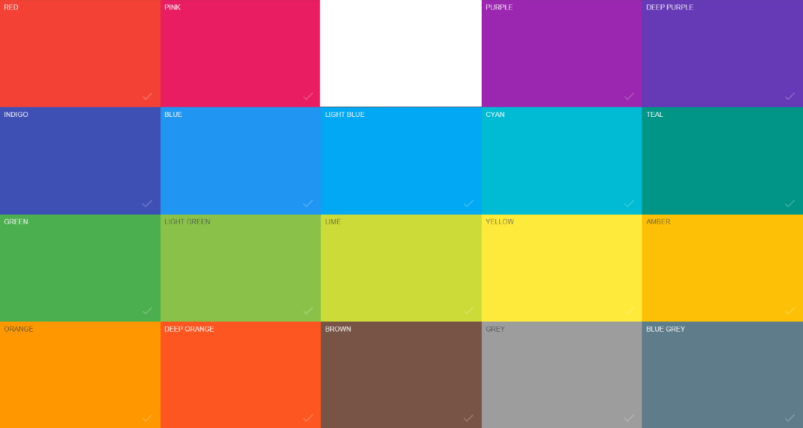
The toolkit's material controls (see list below) were designed to follow the color palettes and animations defined by the Material Design Specifications.

Each control exposes a MaterialAccent property, which represents the material color palette that will be applied to the control. Each color palette defines complimentary background and foreground colors in addition to any other required brushes, such as the selection and border brushes. Setting the MaterialAccentBrush or MaterialForeground properties will override the values defined by the color palette assigned to the MaterialAccent property.
- MaterialButton
- MaterialCheckBox
- MaterialComboBox and MaterialComboBoxItem
- MaterialDropDown
- MaterialFrame
- MaterialHamburger
- MaterialHamburgerMenu and MaterialHamburgerMenuItem
- MaterialListBox and MaterialListBoxItem
- MaterialProgressBar
- MaterialProgressBarCircular
- MaterialRadioButton
- MaterialSlider
- MaterialSwitch
- MaterialTabControl and MaterialTabItem
- MaterialTextField
- MaterialToast
- MaterialToolTip
  <StackPanel>
      <!-- Using one of the predefined material palettes -->
      <xctk:MaterialButton Content="DeepPurple material palette"
                           MaterialAccent="DeepPurple"
                           Width="150"
                           Height="25"
                           Margin="5" />
      <!-- Using a custom brush -->
      <xctk:MaterialButton Content="Custom colors"
                           MaterialAccentBrush="Aqua"
                           MaterialForeground="White"
                           Width="150"
                           Height="25"
                           Margin="5" />
  </StackPanel>
