-
Notifications
You must be signed in to change notification settings - Fork 19
Tabs, Groups and HelpButton
In this post I’ll review some more common ribbon features, namely:
- Tabs
- Groups
- Help Button
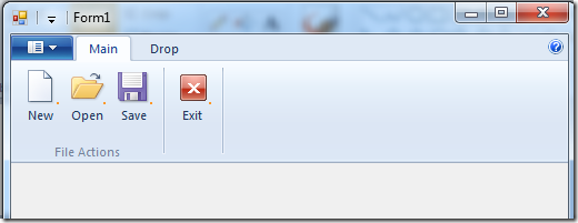
The result of this post is yet another sample application, named 04-TabGroupHelp. You can find it on the project page and it looks like this:

Buttons, Buttons, Buttons So what are tabs? Just containers for other controls. In this sample will use only buttons. I’ll elaborate on the other control types on future posts. Every tab can contain several groups, which are just a logical division of the controls in the tab, in this post – buttons… What is the help button? just another button. For some reason it got its own special place and predefined icon (look on the right side of the image).
Using Tabs and Groups The commands markup is always the same, just a list of items that attach a mnemonic used by the programmer with an ID used by the ribbon framework. And some string and bitmap resources. As always, the interesting part lies in the Application.Views markup:
<Application.Views>
  <Ribbon>
    <Ribbon.Tabs>
      <Tab CommandName="cmdTabMain">
        <!– scary part –>
        <Tab.ScalingPolicy>
          <ScalingPolicy>
            <ScalingPolicy.IdealSizes>
              <Scale Group="cmdGroupFileActions" Size="Large" />
              <Scale Group="cmdGroupExit" Size="Large" />
            </ScalingPolicy.IdealSizes>
            <Scale Group="cmdGroupFileActions" Size="Medium" />
          </ScalingPolicy>
        </Tab.ScalingPolicy>
        <!– useful part –>
        <Group CommandName="cmdGroupFileActions" SizeDefinition="ThreeButtons">
          <Button CommandName="cmdButtonNew" />
          <Button CommandName="cmdButtonOpen" />
          <Button CommandName="cmdButtonSave" />
        </Group>
        <Group CommandName="cmdGroupExit" SizeDefinition="OneButton">
          <Button CommandName="cmdButtonExit" />
        </Group>
      </Tab>
      <Tab CommandName ="cmdTabDrop">
        <Group CommandName="cmdGroupDrop" SizeDefinition="ThreeButtons">
          <Button CommandName="cmdButtonDropA" />
          <Button CommandName="cmdButtonDropB" />
          <Button CommandName="cmdButtonDropC" />
        </Group>
      </Tab>
    </Ribbon.Tabs>
  </Ribbon>
</Application.Views>
What I’ve defined in this markup is two tabs. The first tab has two groups and the second tab has one group. I’ve marked to important parts of the markup in the first tab. Unfortunately, due to the ribbon schema definition the scary part must come before the useful part.
The useful part: just a simple definition of the groups in the tab, and the controls in the group. one interesting thing to note is the SizeDefinition attribute on the Group tag. This is a definition of the layout for the controls in the group. You can define your own layouts or use a predefined list which usually is quite enough. see the full list (with convenient images) at “Customizing a Ribbon Through Size Definitions and Scaling Policies” on MSDN.
The scary part: In order to understand this part you should know that one of the features of the ribbon framework is the ability to re-layout your ribbon controls according to the amount of space it has. It pretty much handle this automatically but it does require you to define hints on how you want your layout to scale when the application form gets smaller and smaller. So, in the scary part we first define the ideal size of each group. The size can be one of four values: Large, Medium, Small and Popup. Popup means that the whole group was shrunk to a single icon that upon clicking popups the original group.
After defining the ideal size for the group, you can define the order of scaling down, meaning which group should scale down first. In this way you can make your application most important controls more visible then less important ones.
The code-behind for acting on these buttons is the same as in the previous posts. Just register to the ExecuteEvent event of the correct button.
Using Help Button To use the help button just add the following to the view markup:
<Application.Views>
  <Ribbon>
    <Ribbon.HelpButton>
      <HelpButton CommandName="cmdHelp" />
    </Ribbon.HelpButton>
    <Ribbon.Tabs>
      …
    </Ribbon.Tabs>
  </Ribbon>
</Application.Views>-
Basics
- Introduction, Background on the windows ribbon
- Basic Ribbon Wrapper Basic .NET wrappers for windows ribbon.
- Quickstart Tutorial
- First WinForms Ribbon Application How to create an empty WinForms application with ribbon support.
-
Working with Ribbon Controls
- Application Menu with Buttons How to use the ribbon application menu.
- Application Menu with SplitButton and DropDownButton How to use the ribbon application menu with ribbon split button and ribbon dropdown button controls.
- Tabs, Groups and HelpButton How to use ribbon tabs, groups and the ribbon help button control.
- Spinner How to use the ribbon spinner control.
- ComboBox How to use the ribbon combo box control.
- DropDownGallery, SplitButtonGallery and InRibbonGallery How to use the ribbon drop down gallery, split button gallery and in ribbon gallery controls.
- CheckBox and ToggleButton How to use the ribbon check box and toggle button controls.
- DropDownColorPicker How to use the ribbon drop down color picker control.
- FontControl How to use the ribbon font control.
- ContextualTabs How to work with ribbon contextual tabs.
- ContextPopup How to work with ribbon context popup.
- RecentItems How to work with ribbon recent items control.
- QuickAccessToolbar How to work with the ribbon quick access toolbar.
- The Ribbon Class How to work with the ribbon class. Methods, Properties, Events
- EventLogger Since Windows 8: Logging ribbon events
- UICollectionChangedEvent How to work with the ChangedEvent in an IUICollection
-
Working with miscellany Ribbon features
- ApplicationModes How to work with ribbon application modes.
- SizeDefinition How to define custom size definitions for ribbon group elements.
- Localization How to localize a ribbon.
- Changing Ribbon Colors How to change the ribbon colors.
- Working with Images How to work with images in the ribbon.
- Use Ribbon as External DLL How to load ribbon resources from external DLLs.
- Wrapper class RibbonItems An auto generated wrapper class from the ribbon markup.
-
Designing, building, previewing Windows Ribbon with RibbonTools
- RibbonTools basics Settings, Command line, ...
- Create a new project Create a WordPad sample project
- Preview the Ribbon
- Specifying Ribbon Commands
- Designing Ribbon Views
- Convert Images to Alpha Bitmaps
-
Modeling Guidelines
-
How to ...